Project Duration: March 2023 to May 2023
Tif’s Ticket is a concert ticket purchasing app founded in the suburbs of a metropolitan area. It strives to deliver quick, specialty offers with discounts. Tickets offer a wide spectrum of competitive pricing. The app targets customers ranging from artists to listeners who lack the time to buy tickets by going to the stores.
Project overview The problem: Shops create hurdle to buy tickets for shows. My role: As UX designer designing the app from conception to delivery. The goal: Design an app for ticket purchasing that allows users to easily search nearby events and purchase tickets without hassle. Responsibilities: Conducting interviews, paper and digital wireframing, low and hi-fidelity prototyping, conducting usability studies, accounting for accessibility, and iterating on designs.
Understanding the user User research: I conducted interviews and created empathy maps to understand the users I’m designing for and their needs. A primary user group identified through research was working adults who don’t have time to go to stores. This user group confirmed initial assumptions about Tif’s Ticket customers, but research also revealed that time was not the only factor limiting users from buying from home. Other user problems included obligations, interests, or challenges that make it difficult to get personalization for ticket purchase.
Pain points
- Time: Working adults are too busy to spend time to go to stores.
- Accessibility: Stores for buying tickets are not user friendly as much as online platforms.
- Information Architecture: Text-heavy menus in apps are often difficult to read and buy from.
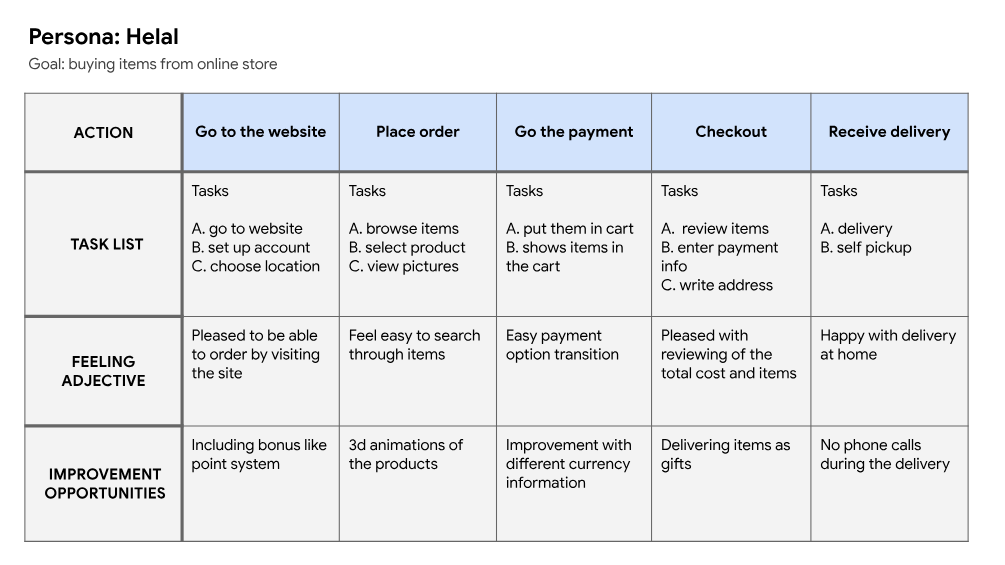
Persona Problem statement: Helal is a busy professional and music lover who needs to easily buy concert tickets online because he want the tickets to be available at right time.
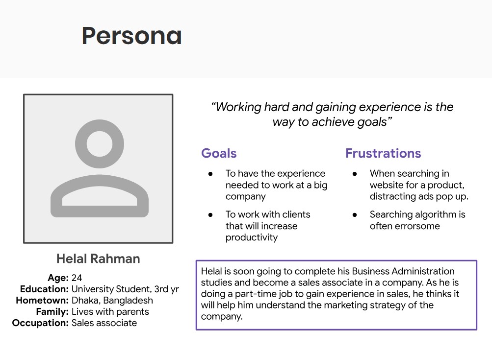
User journey map: Mapping Helal’s user journey revealed how helpful it would be for users to have access to a dedicated Tif’s Ticket app.
Starting the design Paper wireframes: Taking the time to draft iterations of each screen of the app on paper ensured that the elements that made it to digital wireframes would be well-suited to address user pain points. For the home screen, I prioritized a quick and easy ordering process to help users save time.
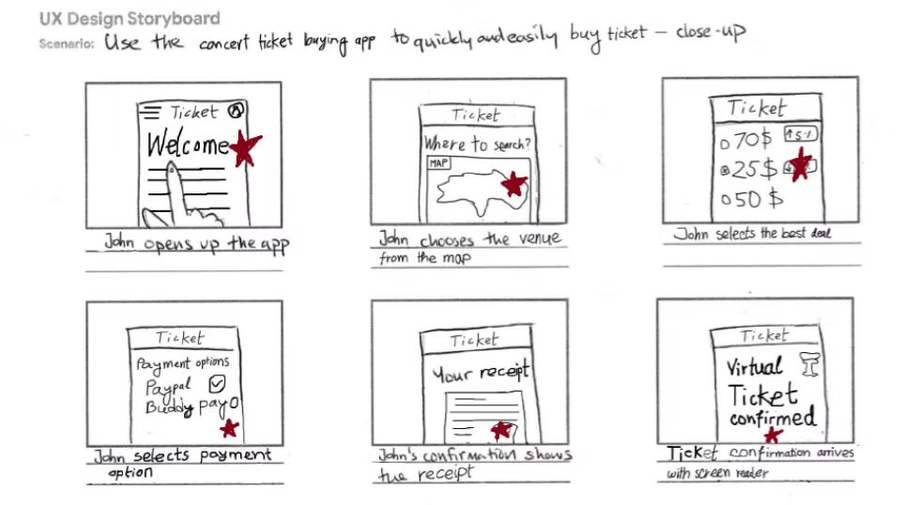 Stars are used to show where the actions will take place in the digital wireframe.
Digital wireframes

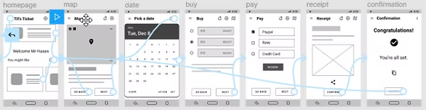
Low-fidelity prototype: The low-fidelity prototype connected the primary user flow of building Tif’s ticketing app, so the prototype could be used in a usability study with users.
Usability study
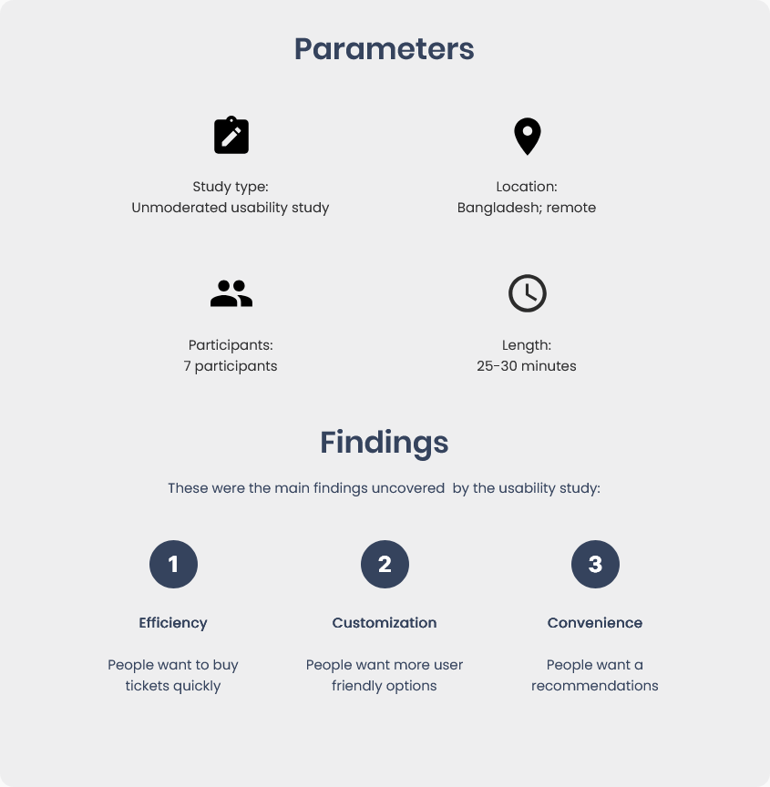
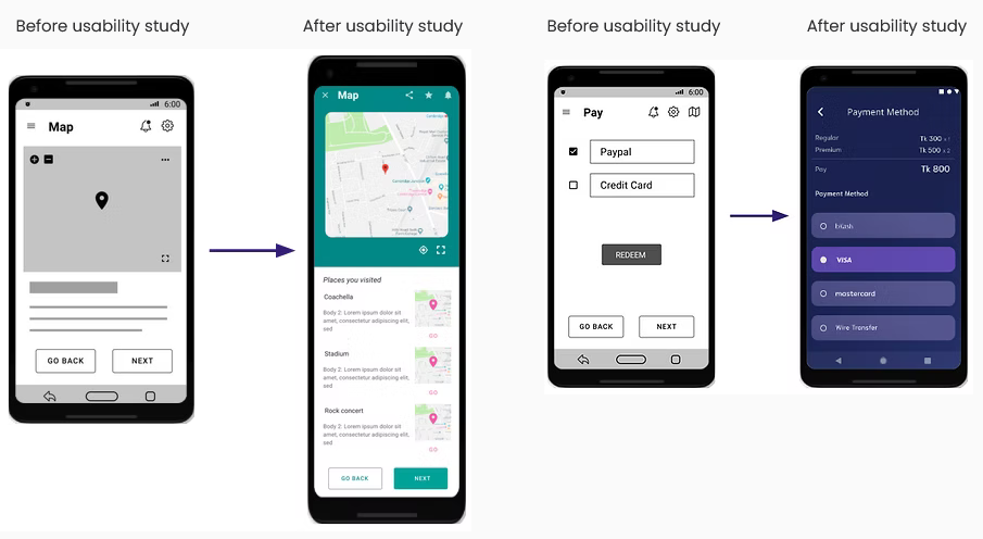
Refining the design Mockups: There were a few actionable insights I came up with from the usability studies. One of these was adding a list of places visited within the app’s map page to help users save even more time. The early designs allowed for some payment options, but after the usability study, I added the options to also choose more payable methods. This gives users the ability to pay from digital wallet or through wire transfer.

High-fidelity prototype
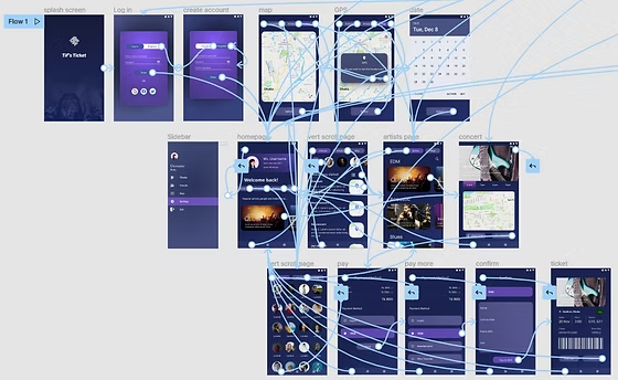
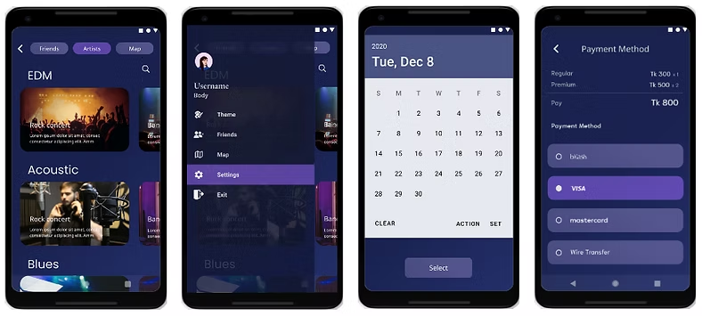
The hi-fi prototype followed the same “search and buy a ticket” user flow as the lo-fi prototype, and included the design changes made after the usability study.
Accessibility considerations:
- In the sidebar, there wasn’t any option available, after the usability study a side option has been added for accessing the settings and other options.
- The list of the places visited added with the map page for easier navigation based on the user preference which provides the user recommended visits to the most visited places.
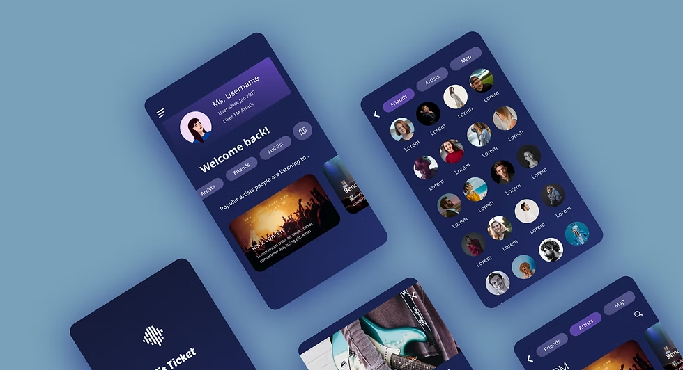
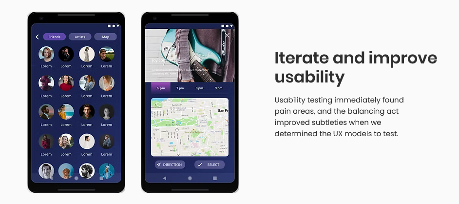
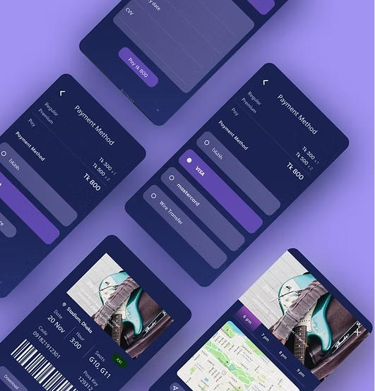
Iterate and improve usability: Usability testing immediately found pain areas, and the balancing act improved subtleties when we determined the UX models to test. Mobile: The design concept with ample information removes unnecessary sources that isn’t required for evaluation. Design System: It was necessary to create a basic design and accomplished before the mockup is built.
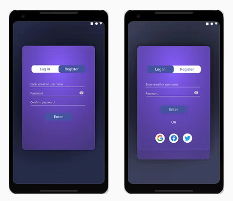
Sign up for customized experience: Integrated registration in the product onboarding for a personalized user experience.
The design will not disappoint: A plethora of images and symbols, vibrant colours, and little animated functional pieces all work together to create a creative mood and immerse the user in the app’s unique environment.
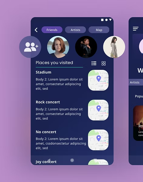
Finished product

Going forward
Takeaways
Impact: The app makes users feel like that Tif’s Ticket is the real deal. One feedback from peer: “The app made it so easy and fun to build my ticket of the concert! I would definitely use this app as a go-to for a quick, easy and convenient ticket.”
What I learned: While designing the Tif’s Ticket app, I learned that the first ideas for the app are only the beginning of the process. Usability studies and peer feedback influenced each iteration of the app’s design.
Next steps
Conduct another round of usability studies to validate whether the pain points users experienced have been effectively addressed.
Conduct more user research to determine any new areas of need.